If the website is difficult to use, they can get stuck before they ever reach the service, information or opportunity they came for.
You do not need to understand every part of digital accessibility to start making improvements. Your team can do a few simple things to make content easier to use for more people.
These are not a replacement for proper accessibility testing, but they are a good place to start.
tIP 1
Add useful alternative text to images.
Alternative text, usually called alt text, gives somebody using a screen reader information about an image they may not be able to see.
The important thing is to describe what matters, rather than trying to describe every detail. For example, if you are sharing a photograph of volunteers packing food parcels, useful alt text might be:
“Three volunteers packing food parcels at a community centre.”
That tells someone what the image shows and why it matters.
Decorative images do not always need a description. The question I would ask is: if somebody could not see this image, what information would they be missing?
As someone who uses a screen reader, good alt text makes a real difference. Poor alt text can leave you guessing what everybody else is looking at.
tIP 2
Keep your language clear.
People often come to charity websites because they need information or help.
That is not the time to make somebody work through long sentences, internal language or jargon to understand what you mean. Try to explain things in the same way you would if somebody asked you the question directly.
Instead of:
“Applicants must satisfy the relevant eligibility criteria prior to commencement of the referral process.”
you could say:
“Before you apply, check that you are eligible for the service.”
Clear language helps lots of people, including people with cognitive disabilities, people using translation tools, and anyone reading quickly or under pressure.
tIP 3
Make sure text is easy to see.
Colour contrast matters.
If the difference between the text and the background is too small, some people will struggle to read it. That can be particularly difficult for people with low vision or reduced contrast sensitivity.
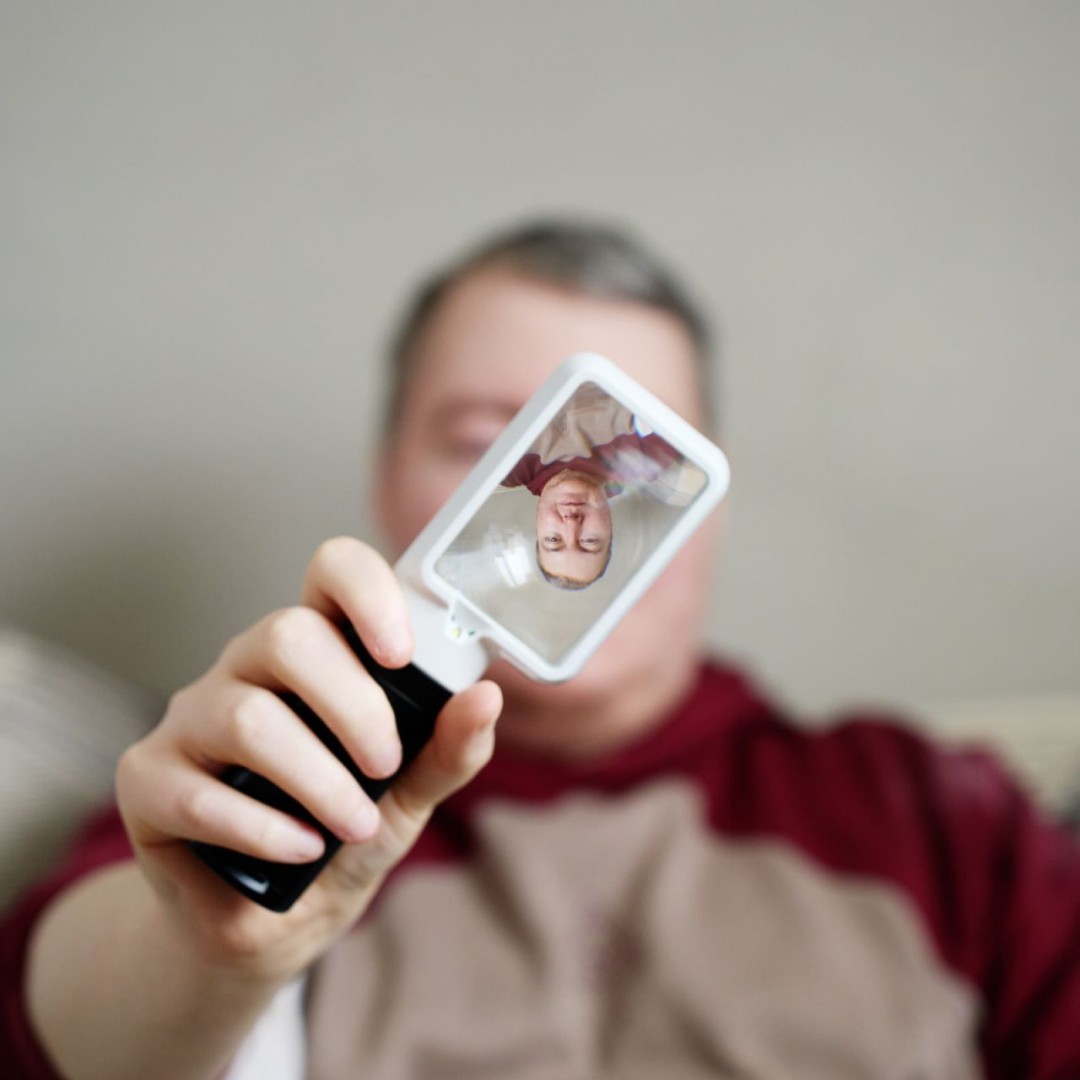
I use magnification regularly, and something being technically visible does not always mean it is comfortable or easy to read.
Be particularly careful with pale text, text over photographs, and brand colours that may look attractive but become difficult to read when used together.
Free contrast-checking tools can help you spot obvious problems, but they should be part of a wider accessibility approach rather than the only check you make.
tIP 4
Give your pages a clear structure.
Headings are not just there to make a page look nice.
They help people understand how the content is organised, and somebody using a screen reader can use headings to move around a page much more quickly.
Think of them like a document's table of contents.
You should normally have one main page heading, followed by clear sections and subsections in a sensible order. Do not choose a heading level because of how big or bold it looks. Use it because it reflects the page's structure.
This is particularly useful on longer pages about services, eligibility, applications or detailed guidance.
tIP 5
Make links tell people where they are going.
Links such as “click here” or “read more” can be difficult when somebody encounters them without the surrounding text. It is much more helpful if the link explains what will happen.
For example:
Download our volunteering guide
is clearer than:
Click here
The same applies when you have several links on one page. If a screen reader user moves through the links quickly, meaningful wording can make it much easier to understand the available options.
Do not forget your forms, documents and other systems!
Your main website is only one part of the experience.
A person may start on your website and then move onto a donation platform, recruitment system, referral form, booking tool or downloadable PDF.
Your organisation might see those as separate systems. The person using them does not.
To them, it is one journey. That is why I would not look at the homepage and assume that tells you whether the whole experience is accessible.
A beautifully designed service page is not much use if the application form at the end cannot be completed using a keyboard or screen reader.

These are useful steps, but they are not the whole answer.
The five areas above can improve a website, but I would be careful not to treat them as an accessibility checklist.
A website can have good alt text, clear headings and strong colour contrast and still contain barriers that only appear when somebody tries to complete a real task.
That is where manual testing and assistive technology testing become important.
When I review a website, I want to know what happens when somebody tries to use it. Can they find the right service? Can they complete the form? If they make a mistake, do they know what went wrong? If they move onto another platform, does the experience still work?
Automated tools are useful, but they cannot answer all those questions.